Processing For Moods

Recently I uncovered a couple of unprocessed photographs in my collection that I took in Death Valley National Park several years ago. These were sitting in my “reject” pile, but upon a second look, I thought each photo had its own merit. When I looked at these two images a little more closely, I began to feel a very different mood with each.

Blue shadows of twilight dance over the dunes of Death Valley National Park

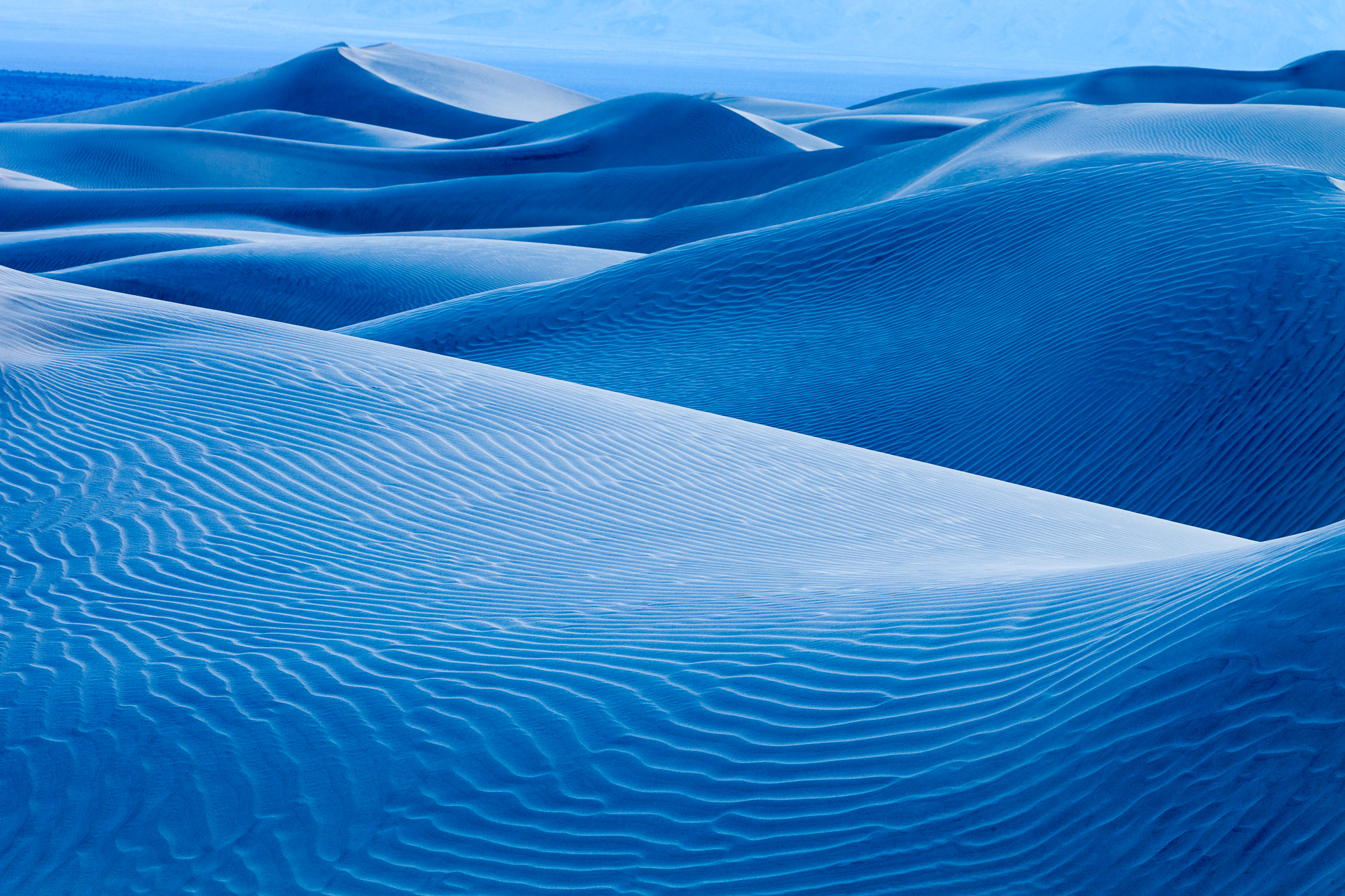
What struck me with the first photo were the vibrant blue hues that emerged after sunset. Shot in deep twilight, the evening sky was reflected off the light tan sand, creating an amazing blue glow throughout the dune field. In order to accentuate this glow, I increased the contrast of the image overall, and increased the clarity. High contrast helped show off the intricate texture of the foreground dune, showing sharpness in each ripple of sand. Contrast was increased two ways: the first was to set the white and black point of the image. While I didn’t use the extreme ends of the histogram, I got pretty close.

The second was to add a contrast s-curve to the image. All adjustments were done in Adobe Lightroom. I kept the white balance pretty close to what the camera chose, increasing it slightly. This gave me a white balance of just over 6000 Kelvins – I was amazed at how blue it still was even after using such a warm color temperature.

In the blue shades of twilight, smooth dunes stretch to distant mountains, Death Valley National Park

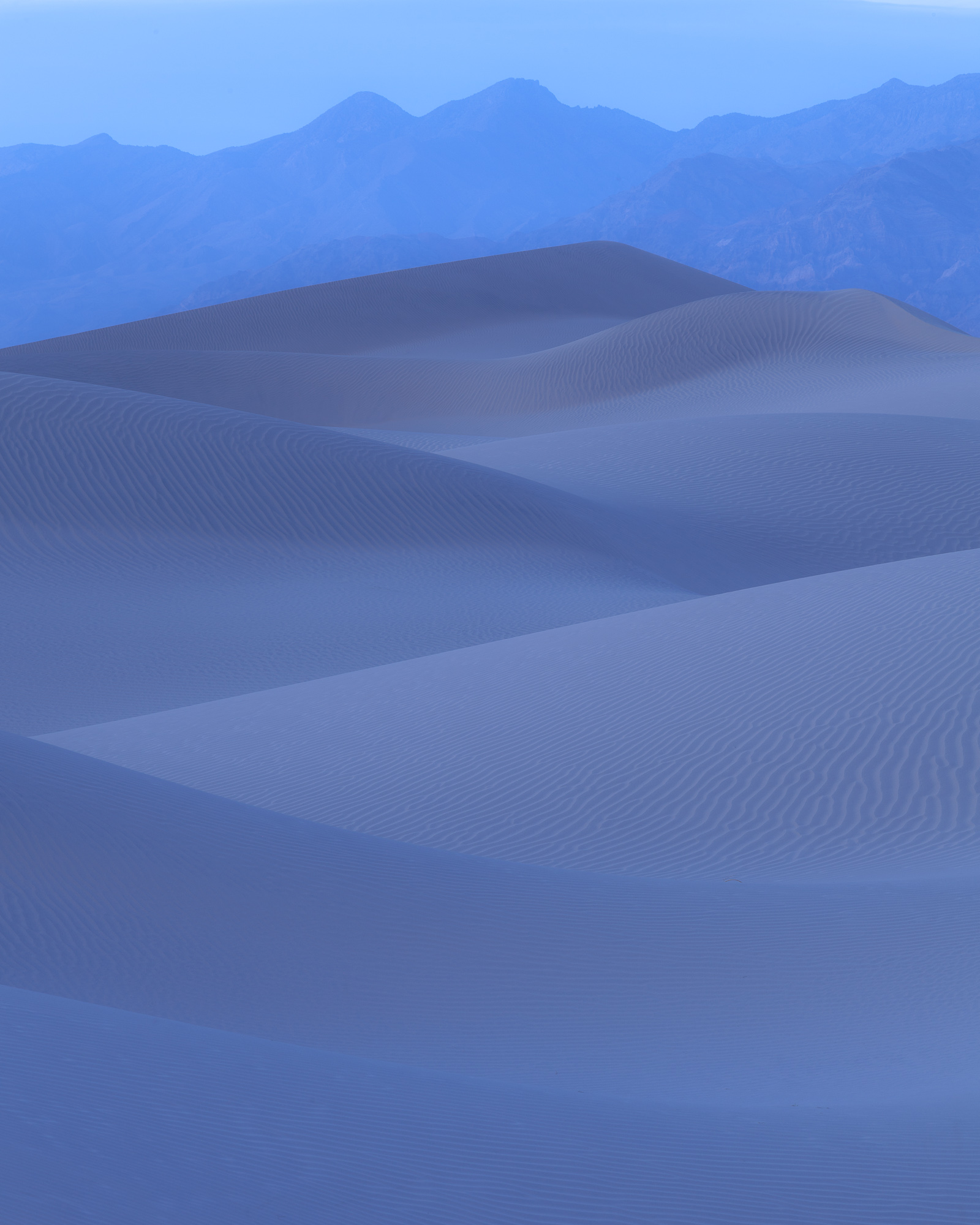
The second image I selected gave me a sense of calm and quietness. In order to accentuate this mood, I kept the contrast very low. I left the white and black points where they were originally, and actually decreased the clarity, giving the dunes a soft, buttery appearance. Because this was more of a graphic image, the low clarity and contrast helped to de-focus attention on the sand texture, and instead allow the dune pattern to abstract, driving the eye up toward the distant mountains.

When making processing decisions, I find it vital to fully understand the message I am trying to convey with each photograph. These moods convey two extremes, even though the images were captured within 20 minutes of each other.

Ghost Trees

White aspen grow in the row in front of a forest of fir trees, Grand Teton National Park

On my recent trip to Wyoming, I spent quite a bit of time photographing stands of aspen. In one particular grove, there was a nice mix of fir with the aspen. One of the guys I was with found this line of leave-less trees in front of a dark backdrop of thick fir trees. As soon as I saw it, I starting thinking in black and white. I really liked the way trees seemed to flatten out in front of the firs. This was definitely not a fall color subject, but something almost morose or Gothic.

White aspen grow in the row in front of a forest of fir trees, Grand Teton National Park

I began by processing this photo in color, but realized that my first instincts were correct. This needed a black and white treatment! One of the wonders of digital conversion to black and white is the ability to set luminance settings per color. This flexibility allowed me to drop just the greens close to black, which created an even backdrop from which the white bark of the trees could pop. It’s like using a magic filter with black and white film. Instead of picking a filter color that would lighten one color and darken its opposite color (for example, a red filter would darken a blue sky), I get to pick and choose in post processing which colors I want light and which I want dark.

What do you think? Which do you like better and why?

Masking: the portrait photographer’s best friend

Ever take several photos of a group, but none of the shots show everybody looking at the camera, eyes open, with a smile on their face? The more people you add to the shot, the more likely this is to occur. Recently I shot a wedding, and although most of the shots came out well, one of the critical portraits (the wedding couple with the bride’s parents) did not turn out. There wasn’t a single frame with everybody looking their best.

The photo on the left was the best shot, but the mother of the bride was looking away from the camera. Because I knew I liked the picture except for this one problem, I hunted through the rest of the similar shots and found the photo on the right. Ordinarily, it would be a throw-away, particularly because the bride is blinking. But the mother of the bride’s expression is perfect.

Good shot, but mother of the bride is looking away from the camera
Mother of the bride is smiling at the camera, but bride's eyes are closed

So now that I have both pictures that I want to combine, how do I do it? First, I open both images in Photoshop (for this example, I will be referring to CS4, but the same technique can be used in CS3). Using the Move tool, I drag one image on top of the other image. This will create a second layer, giving the second image two layers, one with each original image.

Or, if you are using Lightroom, all of the above can be skipped by selecting both photos, and clicking the menu item Photo->Edit In->Open as Layers in Photoshop…

Now that both images are stacked as separate layers, I select both layers in Photoshop and click the menu item Edit->Auto-Align Layers. This is a crucial step in making sure everything blends nicely between both layers when I merge them later. Next, I make sure that the image I want to keep (the left image above) is the top layer, and I add a layer mask (by clicking on the rectangle with the small circle icon at the bottom of the Layers palette). I make sure that black is selected as the foreground color.

With the top layer selected, I use the paint brush tool to paint the photo in the places that I want the bottom layer to show through. In this case, I painted in the mother-of-the-bride’s head. The head from the bottom layer appeared in the top layer, creating the fixed photo below:

Fixed portrait with everyone looking great

If the two photos you are merging have only small differences, the above method can be a great and more natural looking alternative the more traditional approach of selecting from one image and pasting into another.

To HDR or not to HDR

Sometimes capturing a scene that has very bright and very dark areas with a camera can be impossible, because both film and the digital sensor can resolve fewer stops of light than the human eye. Traditionally, this limitation was overcome by using a graduated neutral density filter, which darkened the bright portions of the scene to allow the film to expose the entire scene correctly. With the advent of digital technology, there has been a trend to move instead to post processing and digital manipulation to achieve similar results.

HDR (or High Dynamic Range for the uninitiated) has been sweeping the digital photography world for the past couple of years, mostly thanks to some new software that makes creating these images easy. The goal is simple: use several shots of the same scene at varying exposures to create a single image with a greater dynamic range (the range between pure white and pure black) than your camera can capture. Unfortunately, this goal is usually not achieved with results that look correct to the human eye. The final images appear flat and with low contrast, and the colors tend look almost cartoonish. This can be overcome to some degree by increasing the black level and overall contrast – however correcting the color issue is difficult.

The solution is to go back to digital basics. Instead of letting software automatically combine 3 or more shots at different exposures, combine 2 or more images yourself in an application such as Adobe Photoshop using stacked layers and various blending techniques. Photographer Glenn Randall covers some of these techniques and the principals behind them in his recent article for Outdoor Photographer magazine. The images below demonstrate using image blending verses an HDR software approach.

High Dynamic Range photo of Zion National Park
High Dynamic Range photo of Zion National Park, combining three images shot at different exposures

The above image was created by blending three photographs of different exposures together using software. Once this was done, the contrast was increased significantly. However, as you can see, the colors still look unnatural, with too much yellow in the rock. In addition the two rock faces in the background are washed out.

The image below combines two the the images used to create the previous image. The foreground and mountain were exposed with no evaluative metering compensation. The sky was exposed in a second shot at -1 stop, and blended into the foreground using a graduated mask. The result is more natural looking.

Dramatic cliffs rise above a snowy riverbed with foreground trees, Zion National Park
Two images of Zion National Park blended together using a gradient mask

Some people like the aesthetic of HDR images, and that is great. It brings a new artistic flair to the world of digital photography. But since I am usually trying to create a final photograph that accurately portrays what I see in nature, using the blended approach often works better for me.

Copyright 2017 Hank Christensen