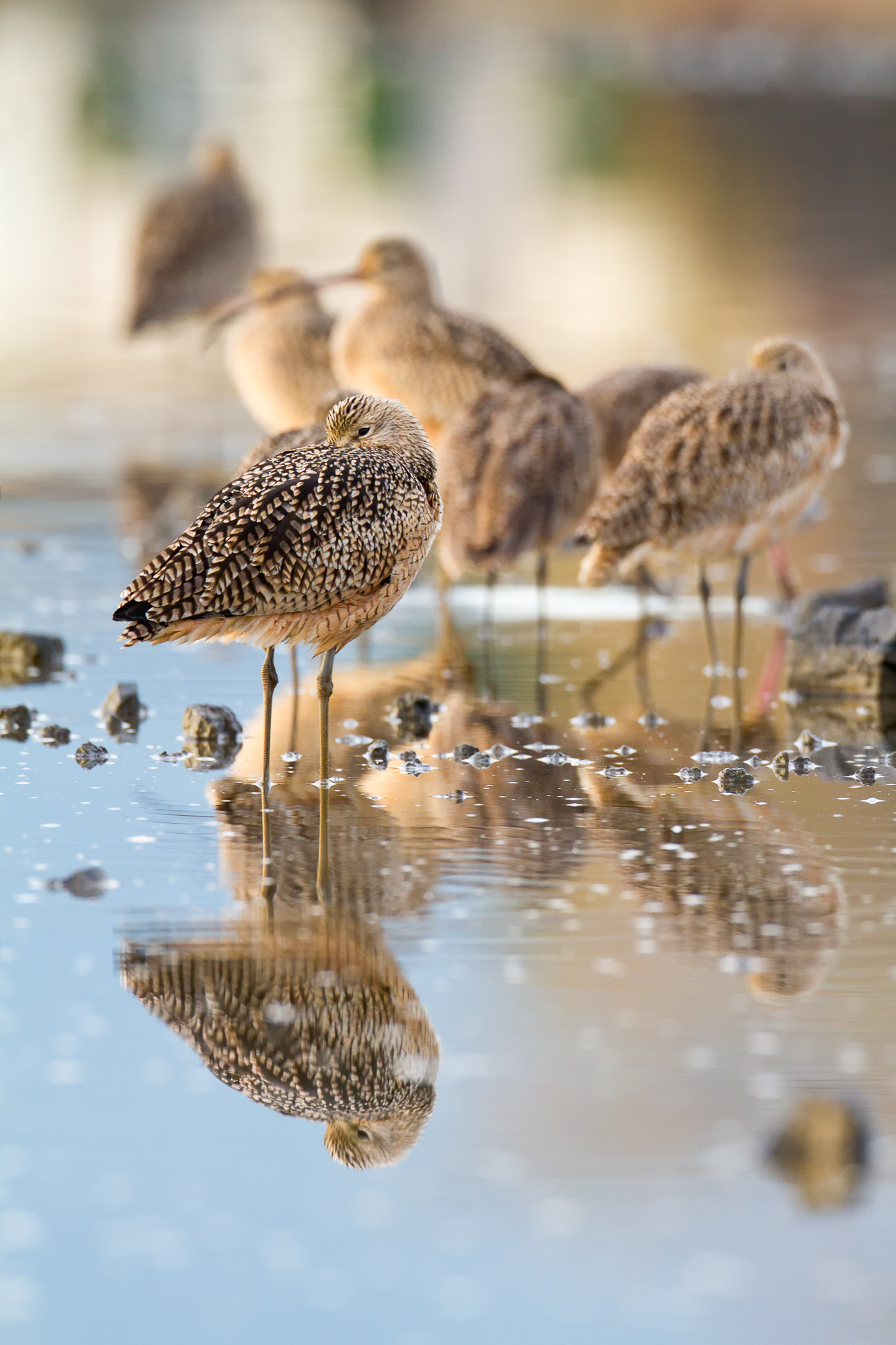
Every once in a while a photo comes along that I love, but seems to break many of my own guidelines that I usually follow. Many times when I’m out shooting wildlife or birds, I’ll take a few photos of the surrounding area, or try to include some habitat, to help me remember where I was and what the conditions were like. This is especially important when I’m making bird portraits. If my goal is a simple, clean background, it can be easy to forget what the surrounding area was like when I only see a bird’s head and shoulders in the photo. The photo of the long-billed curlew above was one such “habitat” shot that I took recently.
As I was reviewing my photos, I found that I really liked this one, even though it wasn’t intended as a keeper. I also realized that it breaks some of the rules that I like to follow in my bird photography. I put myself in the role of photo critic, and came up with the following negative aspects of this image.
1. Cluttered background – In most wildlife photography, one goal in creating a successful photo is to simplify the shot as much as possible. Eliminate distracting elements and leave only those that help support the subject. In this photo, the background is busy and the water surface messy.
2. Depth of field issues – The curlews in the background are out of focus. Are they part of the subject of the image? It is not clear from the focus alone. They are too blurry to be successful subjects, but not abstract enough shapes to blend well into the background.
So then, given the above criticisms, why do I like the photo so much?
1. Color – I absolutely love the color in this photograph. I like the pastel blues and tans, and the black in the first curlew’s feather pattern really pops.
2. Wildness – Sometimes the simple portrait with a pure single color background can get old. Even though they can be elegant, sometimes they lack the wild and wooliness of the real natural world. This photo serves up enough chaos to do justice to all the birds eating and preening in a bunch that morning.
3. Leading lines – The photo leads the viewers eye well through the frame and into the distance. Starting naturally at the bird on the left in sharp focus, the eye is attracted to the sleeping bird to the far right of the frame, because of the repeated shape of the first bird. Then the eye draws up and left along the line of birds, finally resting on the bird in the upper left of the photo, which is the farthest distinguishable object from the camera.
It is important to choose your best images in order to edit your collection of photos. Beyond that however, it is important to understand why you chose those photos. Doing so will help you to make better informed decisions about future photos, instead of just going with your gut. Next time you say to yourself, “I really like this one,” or “this one doesn’t work for me,” dig a little deeper and list out what you like or don’t like about a photo. What you come up with when your really think about it might surprise you.
So what do you think? A nice break from the norm, or not your cup of tea? Love it or hate it, I’d love to hear your opinion in the comments below.

