Adobe just released a photo and text composition app called Slate. Its purpose is to allow quick and easy creation of stories composed of photos and text. I decided to give it a try, and created a post about the color diversity of Death Valley National Park. Click here to give it a try. It is optimized for mobile, so be sure to try it on your phone or tablet. Let me know what you think in the comments below. Want to see more posts in this format, or is a simple blog post more accessible?
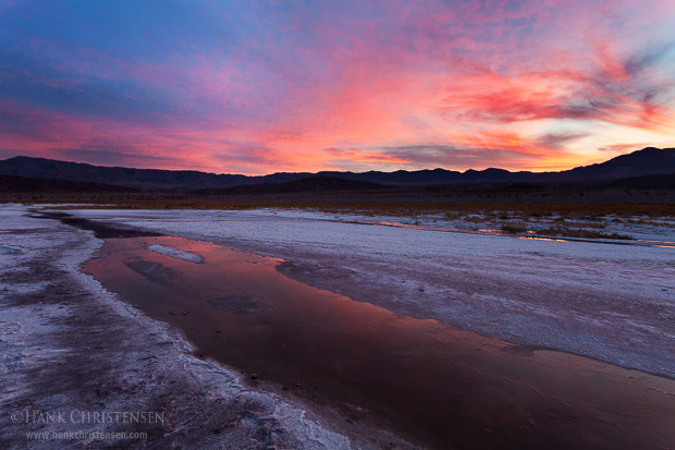
Dawn breaks over a basin of rivulets winding through salt flats, Death Valley National Park
After a bit of thought, I have compiled my top 40 picks from the last 12 months. I selected from a variety of outings and types of photography, ranging from landscape, to wildlife, to pet photography. Unfortunately, 2014 was not the year I caught up on my backlog of photos waiting to be processed, so this list was not selected from all of my 2014 photographs (you’ll have to wait till next year’s round-up for those!)
This year included a fantastic fall color photo trip to the San Juan mountains in Colorado, as well as visits to the Sierra Nevada and of course many bird photographs, including some previously unpublished.
Please enjoy the gallery below. For best viewing (especially if viewing on a mobile device), please click on the following photo:
Gem lies on the floor, fast asleep
Or, just enjoy the gallery here on the page. To view larger photos in the embedded gallery below, click here to enter full screen mode.
If you are interested in compilations from previous years, please see the 2010, 2011, 2012, and 2013 lists.
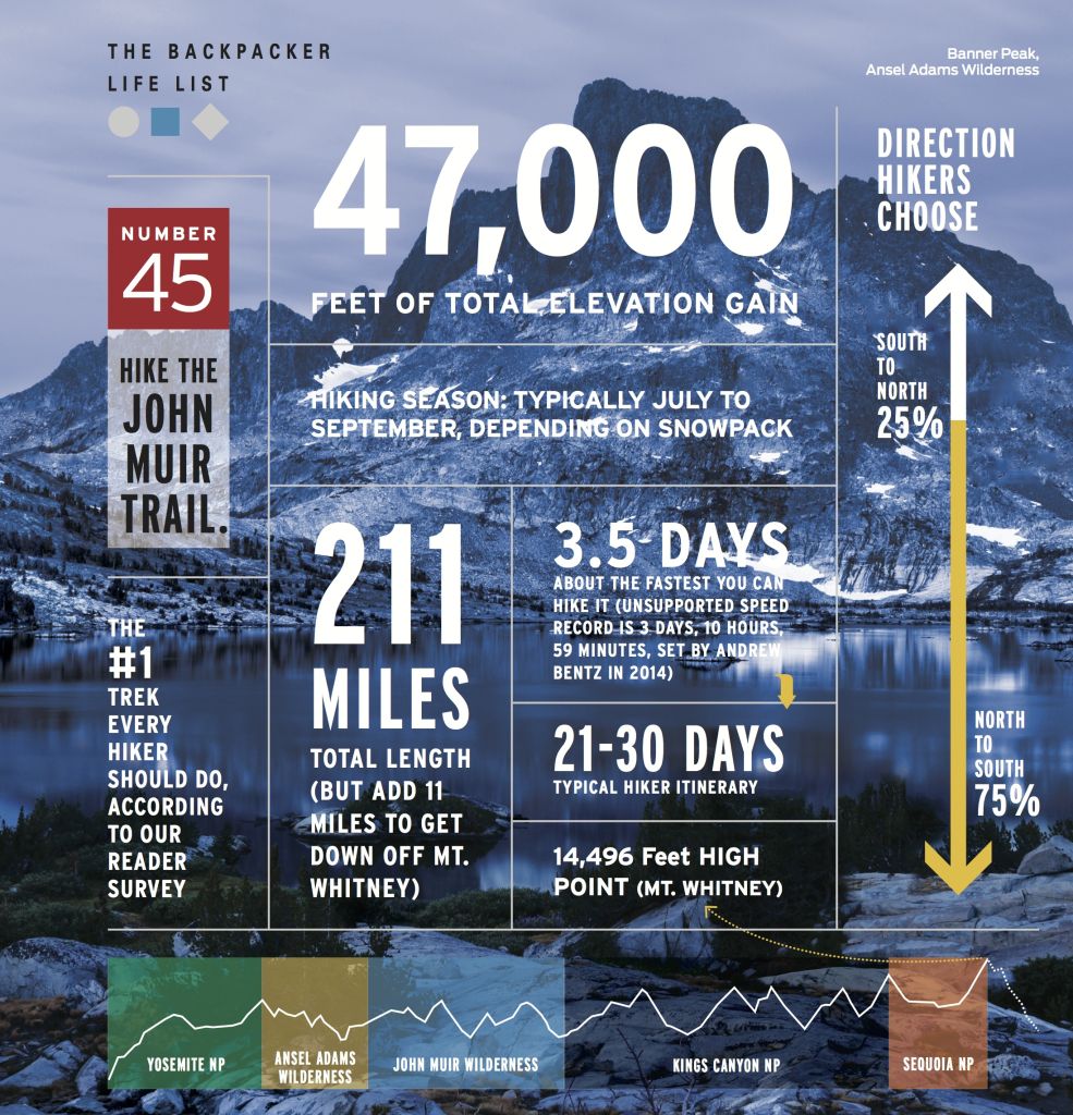
Backpacker Magazine used one of my images of Banner Peak and Thousand Island Lake for an infographic about the John Muir Trail, January 2015 Issue.
Backpacker Magazine used one of my images of Thousand Island Lake in the Ansel Adams Wilderness to create an infographic of the John Muir Trail. The image appears in the January 2015 issue.
There are a couple of nice aspects to this particular publishing. First, the image takes up almost an entire page (in the world of magazine publishing, size does matter!) Second, it was great to have something positive come out of the JMT trip that never really got going.
This image was taken on the last morning before my friend Steve and I had to bail out of the trail. With a 19 day hike planned, we only lasted 3 days on the trail before we were forced to evacuate because of torrential rains.
Dawn breaks over Banner Peak and Thousand Island Lake, Ansel Adams Wilderness
Here is the image without all the text. It was probably chosen because of its subdued nature – if it had been a vibrant sunrise, it likely would not have been used for such a purpose.
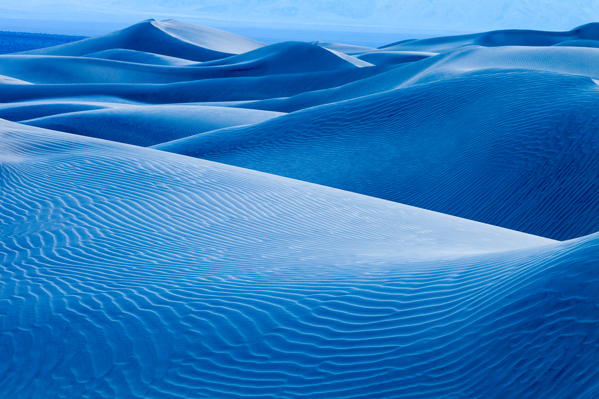
Recently I uncovered a couple of unprocessed photographs in my collection that I took in Death Valley National Park several years ago. These were sitting in my “reject” pile, but upon a second look, I thought each photo had its own merit. When I looked at these two images a little more closely, I began to feel a very different mood with each.
Blue shadows of twilight dance over the dunes of Death Valley National Park
What struck me with the first photo were the vibrant blue hues that emerged after sunset. Shot in deep twilight, the evening sky was reflected off the light tan sand, creating an amazing blue glow throughout the dune field. In order to accentuate this glow, I increased the contrast of the image overall, and increased the clarity. High contrast helped show off the intricate texture of the foreground dune, showing sharpness in each ripple of sand. Contrast was increased two ways: the first was to set the white and black point of the image. While I didn’t use the extreme ends of the histogram, I got pretty close.
The second was to add a contrast s-curve to the image. All adjustments were done in Adobe Lightroom. I kept the white balance pretty close to what the camera chose, increasing it slightly. This gave me a white balance of just over 6000 Kelvins – I was amazed at how blue it still was even after using such a warm color temperature.
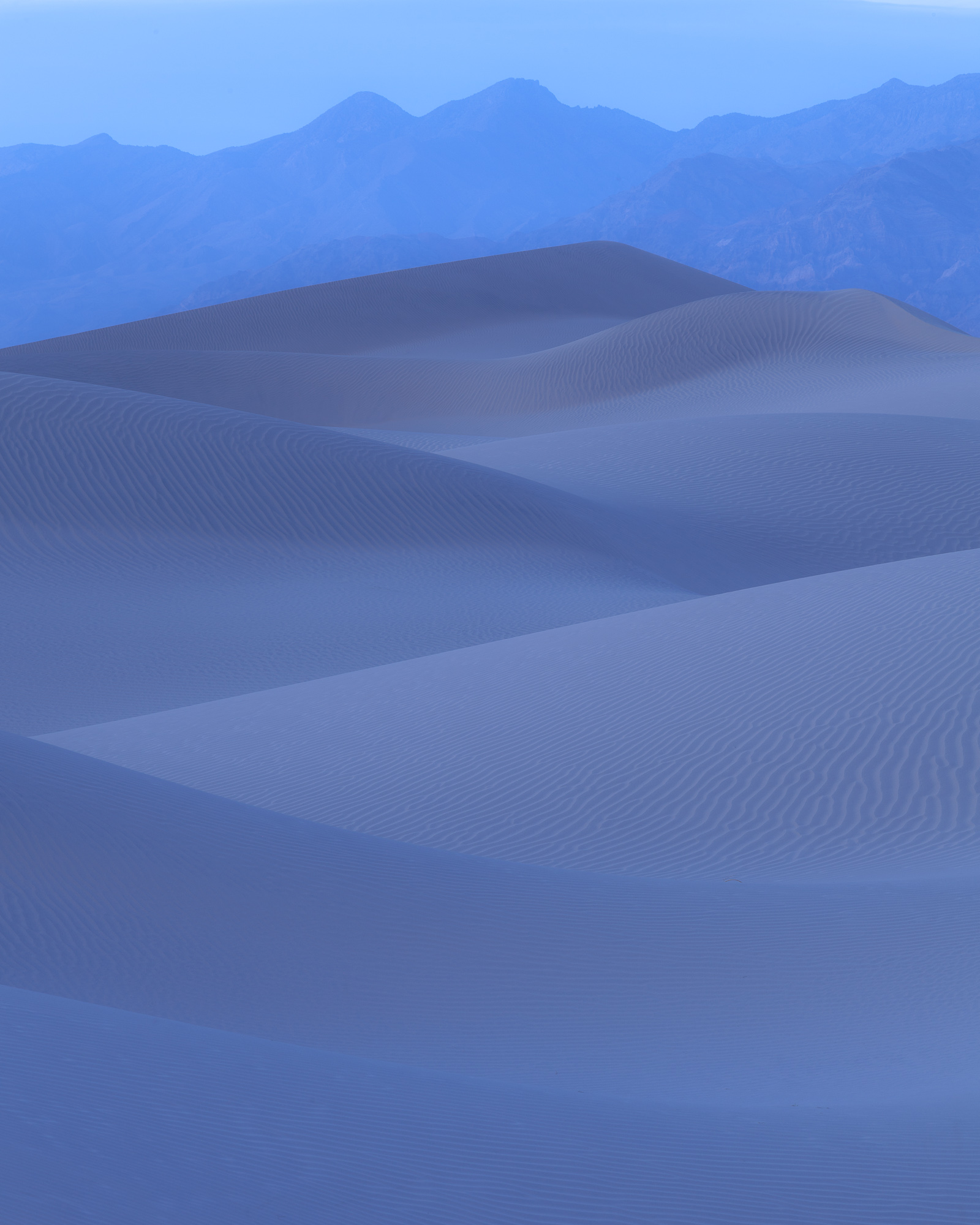
In the blue shades of twilight, smooth dunes stretch to distant mountains, Death Valley National Park
The second image I selected gave me a sense of calm and quietness. In order to accentuate this mood, I kept the contrast very low. I left the white and black points where they were originally, and actually decreased the clarity, giving the dunes a soft, buttery appearance. Because this was more of a graphic image, the low clarity and contrast helped to de-focus attention on the sand texture, and instead allow the dune pattern to abstract, driving the eye up toward the distant mountains.
When making processing decisions, I find it vital to fully understand the message I am trying to convey with each photograph. These moods convey two extremes, even though the images were captured within 20 minutes of each other.